ArtWorks Cincinnati
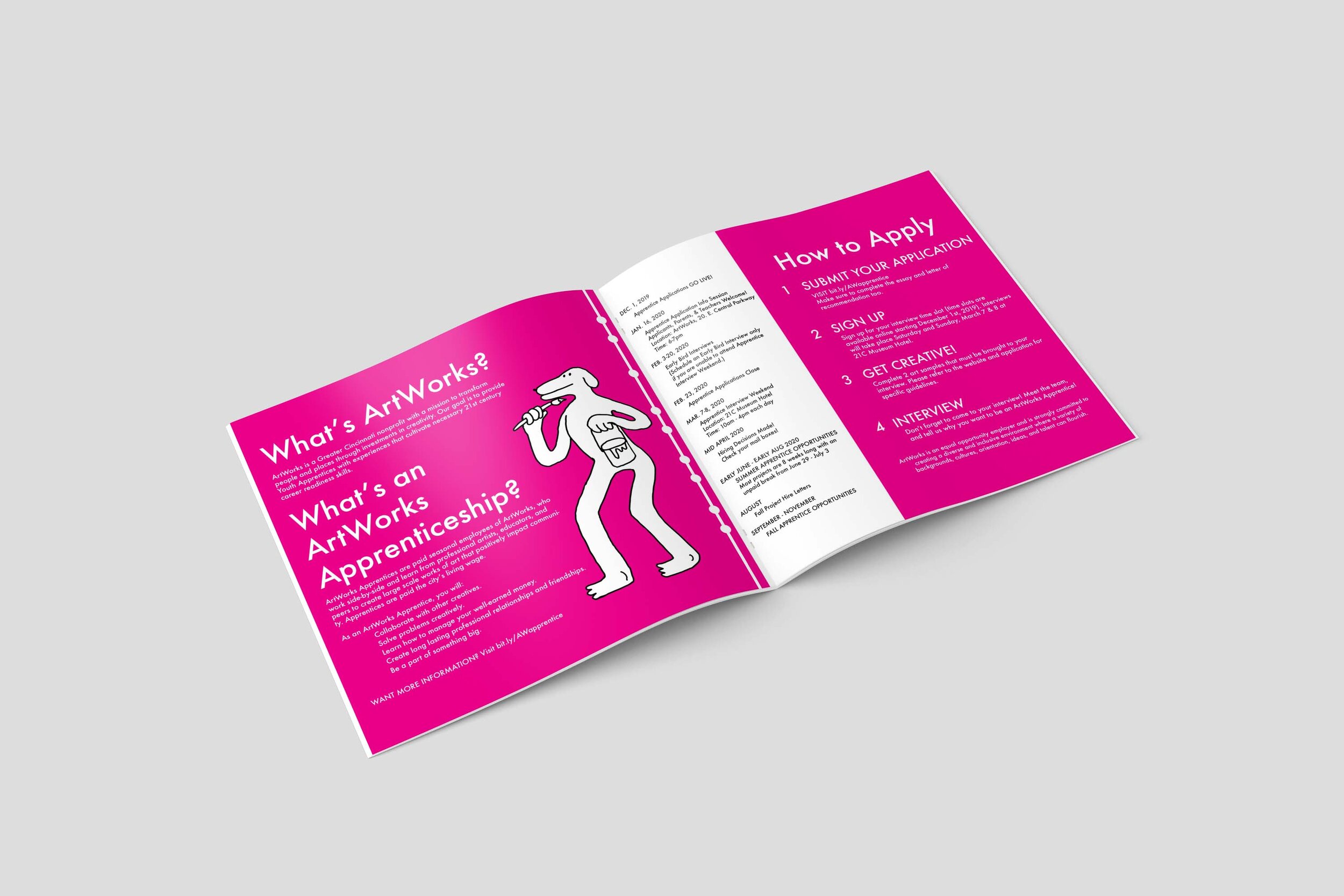
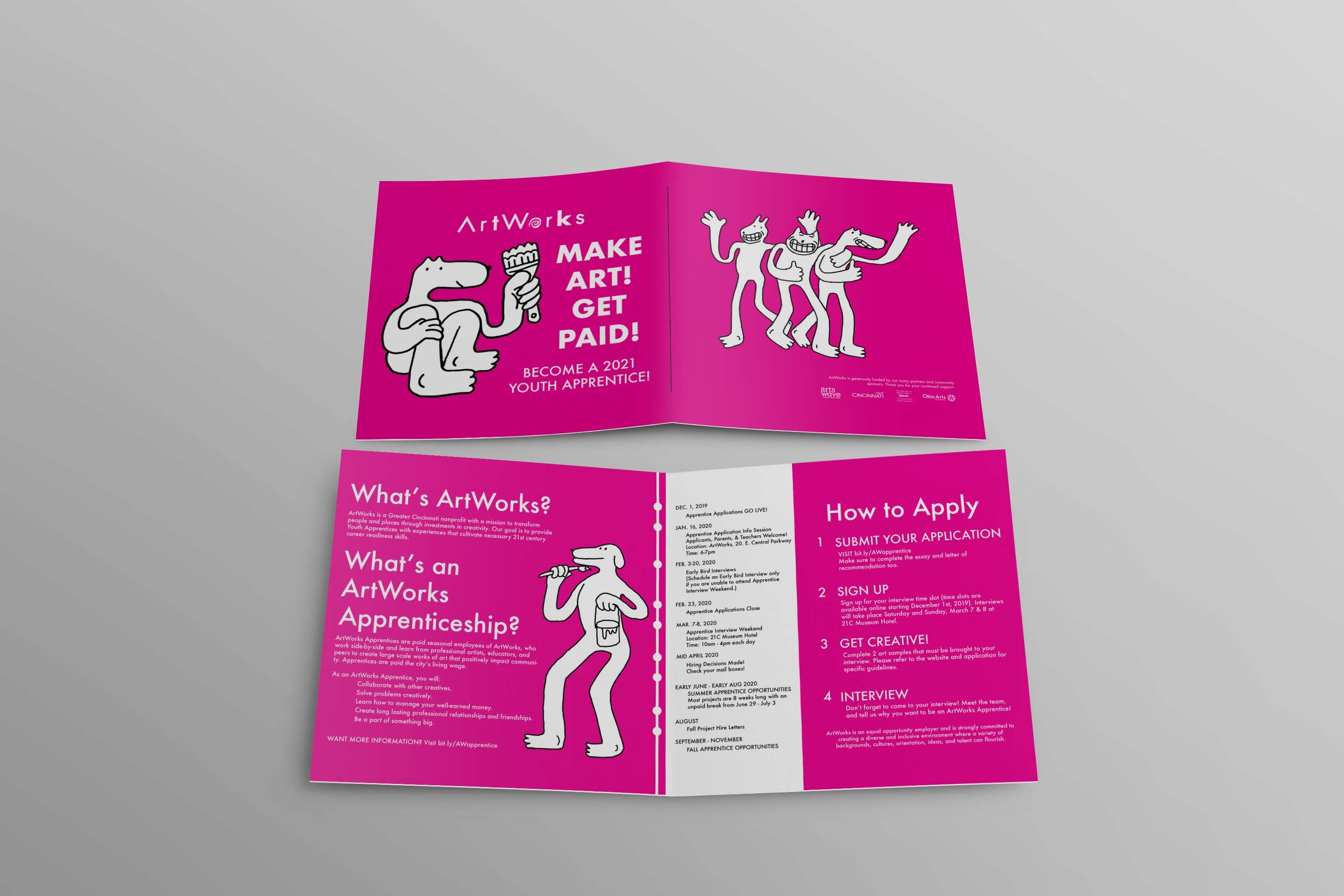
As a fall 2020 intern, I was tasked with designing ArtWorks’ recruitment pamphlets to help attract more young people for their next summer of projects.


Summer Recruitment Pamphlet
The ArtWorks branding is already very effective, so for my design I wanted to lean into that. The hot pink that I used is the color of their logo and iconic in the art community of Cincinnati. People who are already familiar with ArtWorks will recognize the color and someone who is unfamiliar will learn to associate the distinctive bright pink with the organization.
Hot pink and Futura are already established in the ArtWorks brand and I also wanted to add something that was entirely my own. That is why I chose to use my own illustrations. I designed the rest of the pamphlet to be simplistic and legible so I wanted my illustrations to show a little more personality, because ArtWorks is an organization with a lot of personality. I wanted to convey my experience working at ArtWorks for the first time. Working for ArtWorks is fun, way more fun than you would expect a summer job to be, and I wanted the pamphlet to show that.
Brand Guide
To make this pamphlet I followed the ArtWorks brand guide that can be downloaded here