campSITE Sculpture Park
Campsite is an outdoor sculpture park in Camp Washington Cincinnati. It hosts art by local artists and is a social hub for the Camp Washington community.
I worked with a classmate to develop a brand identity for the park and to propose some ways to help alleviate some points of confusion that could be a barrier for newcomers trying to get involved in the park.
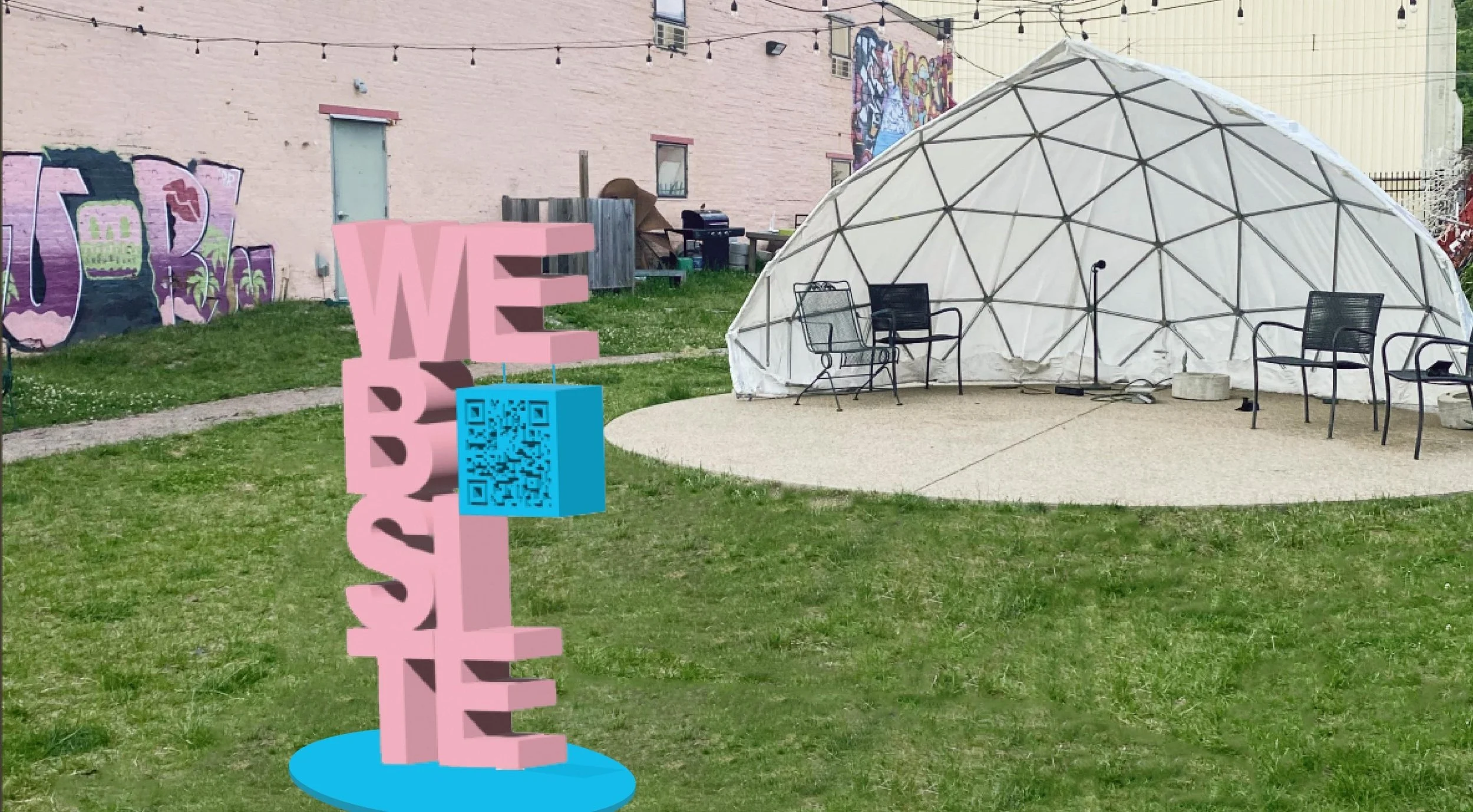
Below is a render of signage using our new brand identity. It is designed to entice the audience and to increase the park’s memorability.


Campsite is full of wonderful art and mysterious items. There is a full sized statue of a mammoth sinking into the mud, the shell of a car, and old signs from Macy’s and Toys-R-Us, to name a few of the standouts.
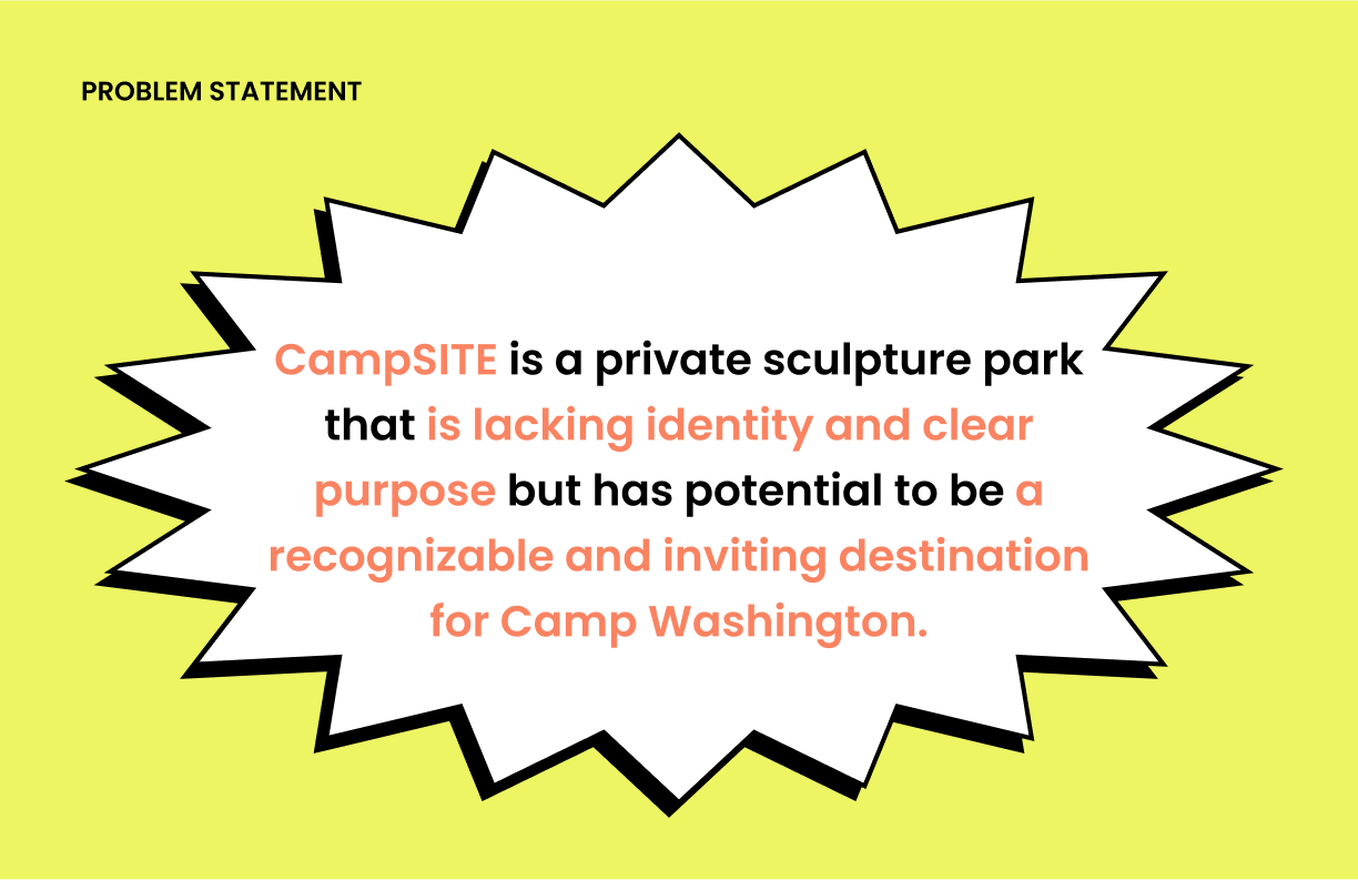
The park is severely lacking in organization. Art and what is essentially trash are displayed side by side with no real distinction. It can be confusing trying to understand what Campsite is all about.
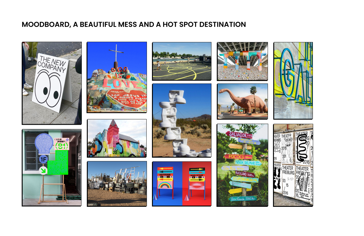
My partner and I decided to lean into the “beautiful mess” aesthetic. Using bright colors, fun patterns, silly graphics, and non traditional type layout we fully committed to the chaos and whimsy that is Campsite. Although that did not stop us from finding ways to make the sculpture park a little less confusing for new visitors.

Above is the campsite mural and accompanying smaller sign I designed in elevation view. The vibrantly colored mural is about 14 feet tall, making it very visible a block away. The silhouette of the mammoth references the mammoth statue in the park. The mammoth is recurring part of the branding that serves as a sort of mascot for the park. The disorganized type is also a reference to an iconic campsite feature. Outside the main portion of the park is a statue of a stack of large and brightly colored rocks. The type is also stacked in a similar way and the brand colors were taken from a photo of the statue.

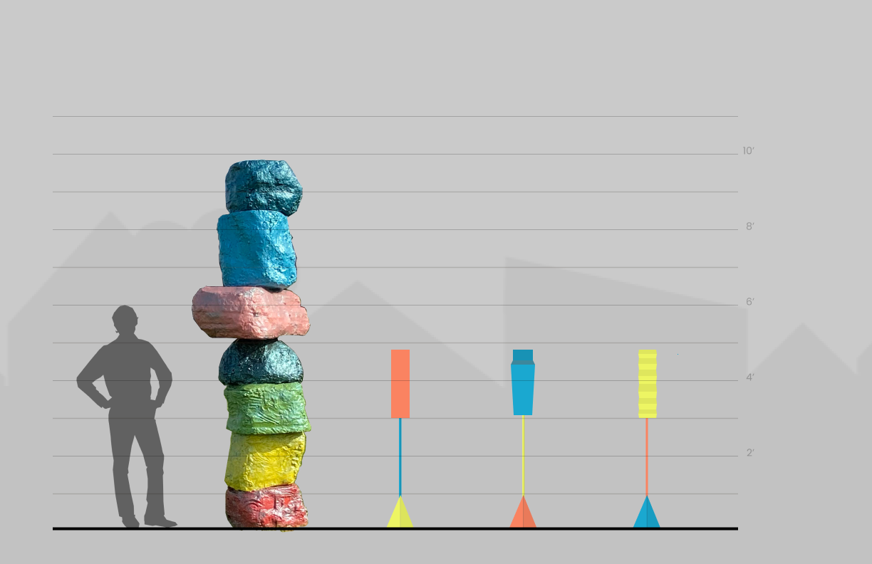
Here we have label designs in elevation view, created by my partner. They are displayed next to the aforementioned rock statue. These signs differentiate the art from the other objects but preserve the park’s chaotic and whimsical tone with the use of nontraditional shapes and bright colors.



Campsite has a website but you would have no idea just visiting the location. We saw an opportunity here to increase the connection between the physical location and its online presence.
Above are 3 explorations and below is a more dimensional concept that I settled on.

